Creative psychology · 14 min read
The Creative Blueprint:
Everything below is the working framework behind our campaigns — written by Jack Doyle, and the reason our Meta management has performed over the last year.
The approach
The biggest wins on Meta come from one loop, repeated: promote an ad built on the psychology below, find what is performing best this week, then rebuild that ad by removing its weak points. We keep improving it through A/B/C/D/E/F/G testing — headlines, hooks, sound effects, the three-second retention hook, thumbnails, captions, and every other creative element.
Once an ad has been dialled in and improved three or four times, that is when it becomes a genuinely optimised ad for the business behind it.
Every business, category, niche and season is different. What works for a gym is not what works for an electrician, a software company, an e-commerce brand or a restaurant. The algorithm shifts constantly with what is popular right now: products, services, music, trends, gossip, talking points, cultural moments. The framework below is written specifically for cold audiences.
Cold vs warm audiences
One of the biggest mistakes businesses make is building content for the wrong audience.
Cold
A cold audience has never seen your brand, product, service or store. They don't know who you are, they don't trust you, and they don't care about your business yet. The creative has to grab attention immediately and communicate value within seconds.
Warm
Warm audiences are people who have already:
- Followed your brand
- Seen your ads before
- Visited your website
- Watched a significant portion of your videos
- Interacted with your content
- Clicked, called or engaged previously
Warm content is a completely different job. It can be direct, detailed and sales-focused because the trust barrier is already lower. That is what retargeting campaigns exist for.
How Meta actually thinks
Meta's advertising system is badly misunderstood. The NVIDIA Grace Hopper CPU and GPU systems behind it run AI models over enormous volumes of advertising data — the earliest serious articles on that architecture appeared around 2016. The simplified version comes down to two ideas.
The ad corpus
This is the pool of ads that are ready to load onto a user's phone as they scroll through the day.
The hierarchy ad index
This is where competing ads sit before they earn distribution. Meta analyses videos, images, headlines, primary text, websites, lead forms, phone number destinations and conversion locations.
Many ads never leave the index, because the first few dollars of spend show almost no user interest. On new accounts Meta is still learning — but even in a brand-new account, a few winners usually start getting distributed more heavily. The goal over time is simple: every ad we create should earn enough engagement to make it into the active delivery pool.
Understanding the market
A useful framing is that only a small slice of any market is ready to buy today:
- 3% are buying now
- 17% are gathering information
- 20% are aware of the problem
- 60% are unaware of the problem, or not interested
In the first month Meta may show ads broadly. Once enough data exists, it starts concentrating on the top 40% — the people who are problem-aware or actively considering. That is precisely why campaigns tend to improve after several weeks of optimisation, and why judging month one on week one is a mistake.
The most important question
Before making any image or video ad, decide what emotion you are trying to create. This is the single biggest piece of advice in this document. Ask: how is this ad going to make someone feel? If the creative produces no emotion, it gets ignored.
The News Method
People love news. News naturally contains curiosity, fear, urgency, status, the desire to know something before everyone else, and the desire to talk about it.
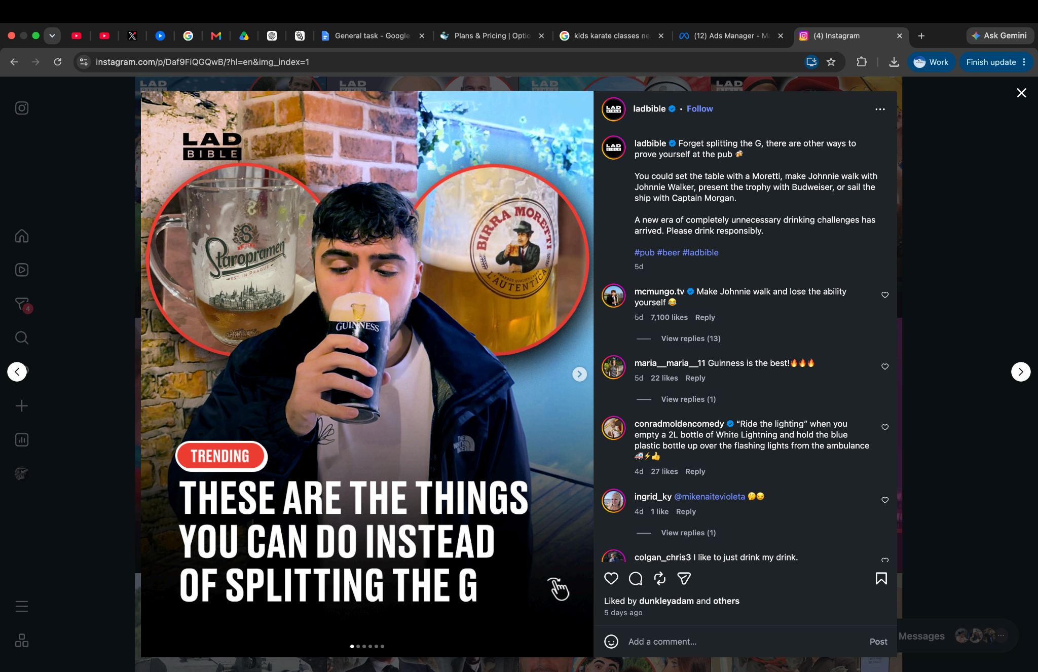
LADbible is one of Facebook's largest accounts, built on the combination of news and entertainment. What most people miss is how the images look — often like they were taken on an old iPhone, frequently with a secondary circular image in the top corner, which gives the creative a magazine layout and increases curiosity.
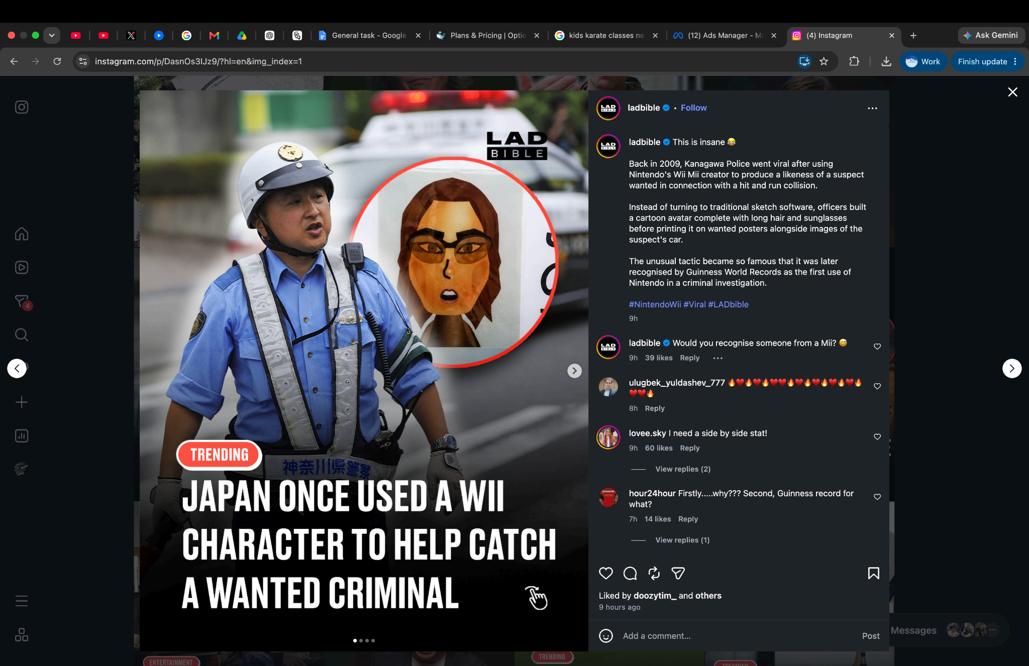
An example of the format applied to a business: “Young restaurant owner from Sydney sets sales records after using the world's newest website data report.” The primary image is a paparazzi-style photo of the owner; the secondary is a pin on a bird's-eye map of the Sydney location. Together they create trust, curiosity, and a reason to read on.
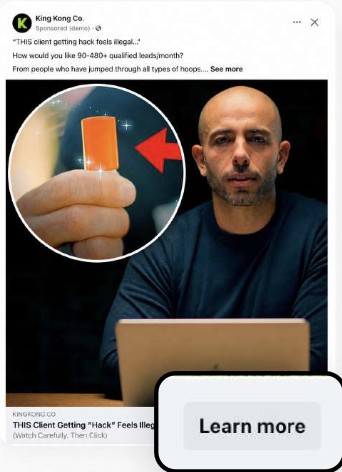
Trust signals and connected accounts
If you're serious about the organic side, run multiple connected accounts. LADbible did it extremely well; Elon Musk effectively does the same across X and SpaceX. A secondary account massively increases long-term reach — for example XrayAI as the professional brand, and XrayAI Behind the Scenes for facts, humour and culture. It helps that “Xray” is already a trusted, familiar word: that is a branding advantage on its own.
Cross-platform testing
Major creators rarely publish blind. Test content on TikTok, identify winners, then upload the winners to Instagram. Instagram rewards accounts that consistently publish content people enjoy — weak posts drag the account's rating down and good content suffers for it. Testing on TikTok first tells you what is performing this week, and every week, month and year is different.
Instagram Trial Reels are an excellent free testing tool because they show content to people who don't already follow you. Use them aggressively before committing ad spend.
Familiarity and brand memory
People rarely buy from a brand they have never mentally stored. Use:
- Templates
- Brand colours
- Consistent fonts
- Repeating layouts
- Similar editing styles
Every post should remind people of the last post. Over time, familiarity becomes trust.
Video ads and the first three seconds
Video is usually the strongest format on Meta because it carries emotion, movement, sound, storytelling and education at once. The first three seconds decide whether the user keeps watching, so that is where the testing effort goes: hooks, movement, zooms, sound effects, music drops, captions and pattern interrupts.
Sound design
Use music intentionally. One of the most effective structures is: intense build-up, suspense, sudden drop, silence, strong statement. Audio is often the emotional engine of the whole ad.
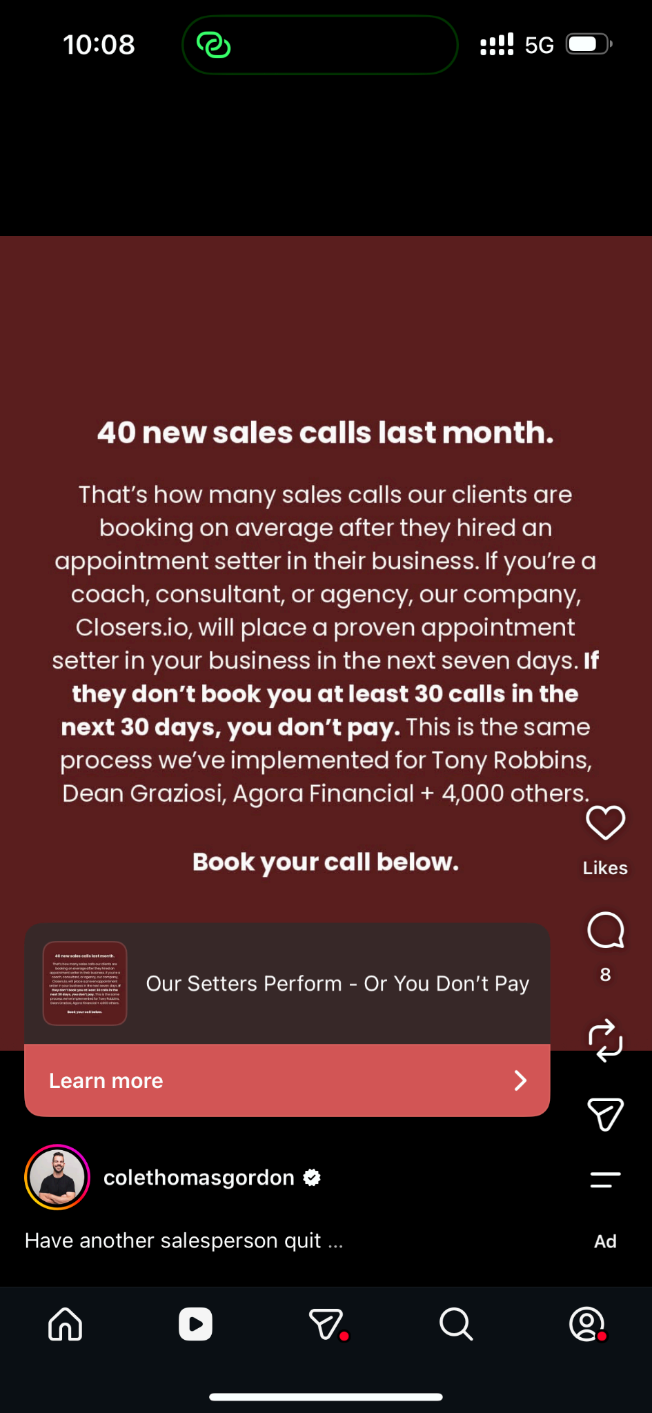
The hook framework
People hate ads. Your hook is competing with the Kardashians, viral memes, attractive people, entertainment, breaking news and sports clips. A Meta ad has to feel like content, not advertising.
The job of the hook is to:
- Stop the scroll
- Trigger curiosity
- Trigger self-interest
- Trigger emotion
- Make the user need the next sentence
Openers that consistently work:
- “I used this…”
- “We can teach…”
- “Why did we start…”
- “For the first time ever…”
And the rule underneath all of it: teach first, sell second.
Headline types
Curiosity
Makes the user need more information: “The one mistake most homeowners make before calling an electrician.”
Shock
Challenges expectations: “What really happens when you box three times a week.”
Direct benefit
A clear outcome: “Lose 5kg in 2 weeks.”
Scarcity and FOMO
Fear of missing out: “Applications close Friday.”
Self-interest
People care about themselves first. Better, richer, stronger, faster, smarter, healthier — write to that.
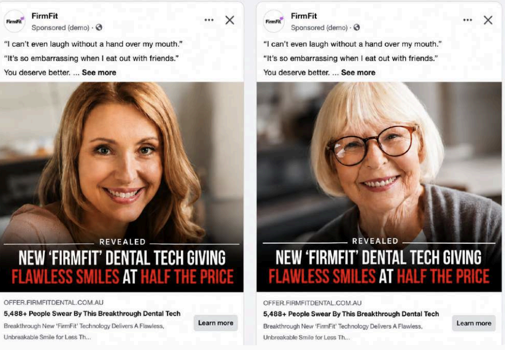
Images that work
The creative types worth cycling through:
- Informative / educational
- Funny
- Fear-based
- Curiosity-based
- The unrefusable offer
- Scroll-stopping image
- Social proof
- Transformation
For images, the winning qualities are simplicity, credibility and local relevance. For local businesses in particular, team photos, customer photos, before-and-after images, work-in-progress shots, review screenshots and local landmarks often outperform heavily designed graphics.
Emotional triggers, scarcity, urgency
The strongest ads create emotion. In order of power: fear, love, anger, curiosity.
Scarcity makes an offer feel premium — limited spots, limited stock, limited enrolments. Urgency gives a reason to act today: ends tonight, ends Sunday, this week only, last intake, final release.
The frat party principle
Any reason is better than no reason. EOFY, new financial year, school holidays, spring special, winter maintenance, grand opening, anniversary sale — the reason itself barely matters, but having one does.
What to actually sell
The highest-quality brands in the world rarely market quality directly. They sell accessibility, speed, simplicity, time savings and results.
For services, show fast response, availability, longer operating hours, easy contact, local presence and real people. For physical products, the product should be intuitive enough that it barely needs instructions, and the packaging should be good enough that people want to keep it. For software, repeated exposure creates familiarity and familiarity creates signups — and a seven-day free trial almost always beats a one-time-use option, because a subscription should feel like a permanent tool inside a business, not a temporary experiment.
Looking forward, tracking AI search traffic, AI-generated website visits and AI-assisted conversions is going to matter. Keeping the ad, the landing page and the brand visually consistent improves trust and makes the whole experience feel like one company.
The Meta Ad Library
One of the most underrated tools in advertising. Every advertiser's live creative is public: what competitors are running, how long an ad has been live, and which formats they keep going back to. If an ad has been running for months, it is working.
On the sales side — everyone hates receiving sales calls, but with enough volume conversion becomes predictable. Ten calls a day, fifty, a hundred: it eventually creates opportunities. The alternative is using existing relationships and referrals to secure meetings with larger companies.
The creative improvement loop
This is the framework we run again and again:
- 1Launch multiple creatives.
- 2Identify the winner.
- 3Analyse its weak points.
- 4Build improved variations.
- 5Test hooks, headlines, music, captions, thumbnails and opening scenes.
- 6Repeat.
Over time the winning ad becomes dramatically stronger. That is how cost per lead comes down — not through a clever targeting trick, but through relentless creative iteration.
Underneath all of it: understand what your customer fears, desires, is curious about, wants to become, and wants to avoid. Then build creative that makes them feel something. That is the difference between content that gets scrolled past and content that gets remembered, shared, clicked and converted.
Want this applied to your account?
We run production, editing and media buying in-house, and partner with trusted Google Ads and email teams when a full funnel is needed.